Source 2.2. and Accessibility
| 10 Jan 2021
Version 2.2 of Source has shipped with a number of improvements to help support you with this.
Focus
If our web page visitors are using a keyboard to navigate our content (whether that is for preference or with the assistance of a screen reader) then it is important that elements that need to be interacted with are focusable (and reachable) by using the Tab button on the keyboard.
Examples of interactive elements would include things like links, buttons, sliders, tabs and FAQs etc. If these cannot be reached (and controlled) via the keyboard then users may be unable to access the content that lies behind.
In addition, not only should these elements be focusable, there should be a visual indicator to show that they are in focus. Browsers apply stylings to do this by default (it is usually a blue outline that you would see) however many web designers / frameworks use CSS to disable this default behaviour because these blue outlines interfere with the 'design'.
Accessibility outlines are often hidden by web designers as they do not work with their visual design for the page. This has a huge impact on those that depend on these supportive stylings.
Source 2.2
As of version 2.2 of Source, users that navigate the web page with a keyboard will see the elements that receive focus to be outlined. Those that use a mouse will not see any of this and the visual design will be completely unaffected.
In other words it's a win win solution.
Skip links
Another feature that supports accessibility is the use of 'skip to...’ links. These allow the user to skip content at the top of the page and get straight to the page content. For people using screen readers this can prevent them having to listen to huge lists of navigation links before getting to the actual content on your page. And remember, people will (you hope) be visiting more than one page and without these links they would have to listen to your navigation links each time!
On your Mac, try activating the inbuilt VoiceOver service and then visit a web page. This is a great way to 'see' the page in a different way. Once done I am sure you will agree that skip links are a great idea!
Source Addons 2.2
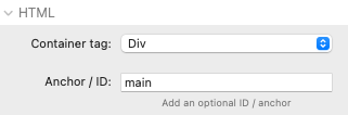
If you have the Addon Pack for Source then version 2.2 will help you here too as there is a brand new ‘Skip links’ stack! With this stack you can add up to 4 links that will be presented to the user as soon as they land on the page and hit tab. Most commonly you would only need 1 link - a ‘skip to main content’ link. In the stack you would add the text that you want and also the anchor name that you want to link to.
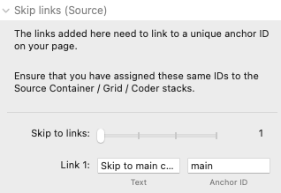
You also need to make sure you have added the same ID to the container stack that you are wanting to link to! The Source Container stacks, Coder and Grid Plus Pro all provide the option of adding an Anchor / ID.
And that’s it! Another step forwards in improving accessibility of your web pages.
If you have other sections that you think would be of note for people using assistive technologies then you could add a link to those sections. For example you might have an ‘Accessiblity statement’ on your page that would be worth linking directly to.
See it in action
Navigate through our Toggle stack page for a good example of what we are talking about here.
When you first land on the page hit Tab. This will bring up the option to skip to the main content. Hitting Enter will then follow that link.
You can then continue hitting the Tab key which will take you to all of the interactive elements. When you land on the toggle stacks hit Space or Enter to actually toggle the item.
What else you can do
To help accessibility you should consider all aspects of your web designs. Take some time and do a bit of Googling to see what other aspects of web design will improve accessibility. Here are another couple of quick tips...
Colour
Colour contrast is vitally important. You need to be sure that your colour choices do not negatively impact on those with sight issues or colour blindness. Always use combinations of colours that have good contrast and try to achieve a AAA rating. There are countless websites that offer a contrast checker. Lately I have been using one called Colour Contrast Checker which also has a useful browser extension.
Image Alt tags
Any images that are not on your page simply for decoration should have an appropriate Alt tag added describing the image. This text will get picked up by those using screen readers. If the image is decorative then the Alt tag should be left blank.
Descriptive links
If you are using text links then the text should describe what the link is doing. Using link text like 'Click here' is not very useful to people using screen readers.
Where you do want to use text such as 'Click here' or where you are using an image (or section or grid item) as a link then you should provide supporting text within the link. To do this in RapidWeaver, simply use the link controls to add an aria-label attribute to your link with the desired guidance / information.
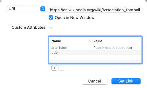
This will add the specified attribute and value into the html for the link and will then get picked up by screen readers when a non-sighted user accesses the link.
Final notes
Accessibility is something that you really need to be considering in your web design. There is no excuse not to make your pages as accessible as possible so that anyone that visits it can get the same experience.
Like this post?
Why not share with others that might like it too?!