Block grid with Grid Plus Pro
| 27 Nov 2020
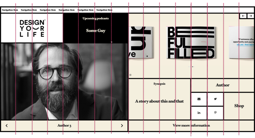
There was a discussion on the RW4ALL forum a long while ago that made reference to the Design your life webpage (Edit: Link removed as page referenced has since changed the design). The webpage layout split opinions design-wise but it is certainly an interesting page.
Joe Workman recently used this page to demo some of the F6 stacks and I received a few emails on the back of that asking about achieving the same kind of layout in Source. Source and its grid stacks are perfect for this kind of thing (there aren't many layouts that you couldn’t achieve with our Grid Plus Pro stack!).
The beauty about using Grid Plus Pro for this kind of layout is that we can build this entire page with a single stack. We don't need to nest grids or columns within further columns or grids. A huge benefit of being able to layout your page in this way is the control that that gives you. At any breakpoint we could position any grid item wherever we liked. As soon as you need to start nesting content then we lose that flexibility.
Overview video
This video gives an overview of the main approaches taken to recreate this page using Grid Plus Pro and also looks at the various additonal features that have been used / included.
Notes on building a grid like this
Grid setup
The Grid Plus Pro stack has been set up with 2 different column definitions:
0px and overdevices are set to use a grid based on 4 columns (repeat(4, 1fr))1200px and overdevices are set to use a grid based on 16 columns (repeat(16, 1fr))
You should be able to tell from the annotated image below that the reason we chose 16 columns on large devices (and indeed 4 columns on small) was to really be able to cater for the little social icon boxes. Each of these social boxes is 1 column wide (on small and large devices). All of the other items have been set to span 2, 4, 8 or all 16 columns as required.

For the large device breakpoint we have also stated in the Grid Plus Pro settings that the grid height should be 100vh. This means that the grid will take up the full browser height and all of the contents (grid item rows) will be sized to fill that space.
In terms of rows, we didn't set up / specify any custom row definitions and are instead just letting the content dictate the height of each row. Like with the column spans above, we have set certain items to span multiple rows. As we stated the grid height in the grid setup, all of this is done in relation to the grid filling the whole browser height.
Borders
Within the grid item settings for each of the 2 breakpoints we are specifying the borders that should be applied to that item.
Hover effect
The only thing that needed to be added in terms of custom CSS was a couple of lines that switched the text and background colours when an item is hovered. We simply add the class name switcher to any grid item that we want to pick up this effect.
.switcher{transition: background-color 0.25s linear}

.switcher:hover{
    color: var(--background-color);
    background-color: var(--accent-color)
}
Note: these colours pick up some of the colours set in the Source Base stack so that if we change those colours in the future this custom css will automatically pick up those changes. (Find out more about using Source Colours).
And that is pretty much it. It is a fairly simple grid to setup. With fixed height grids like this though (on devices over 1200px in this example) you would need to limit how much content you added to any 1 grid item. The grid cannot grow to accommodate a lot of content and so some content would get clipped (though note that you can set up any grid item to enable overflow: scroll so that any additional content could still be viewed).
Project download
The demo project file uses only Source stacks and contains the basic grid structure with some placeholder content. It does not include the additional functionality that was used in the video demo (Splider stack and Limelight stack).
Note: There is a bug in the latest version of stacks that causes some UI elements of hidden stacks to remain hidden after unhiding. All of the grid items in this example project file have been hidden (using the Stacks show/hide option) to save space and stay organised and therefore if you show / expand a grid item then its contents will not show properly. If you leave the item(s) unhidden and then close and reopen the project then the UI will fix itself.
Grid Plus and Grid Plus Pro are part of the Addon Pack for Source - the micro framework for RapidWeaver.
Not got Source yet? Check it out using the button below.
Use another framework? Not a problem - you can use these amazing grid stacks in any framework using our 'Source Grid Enabler' stack! (NB: Source Addon Pack also required).
Like this post?
Why not share with others that might like it too?!

