
The 'fr' unit in CSS Grid
| 21 Nov 2020
Source's Grid Plus and Grid Plus Pro stacks are powered by CSS Grid - the most powerful and advanced layout tool available for your web design projects. If you don't yet know about CSS Grid and what it can offer you then it is worth getting to grips with some of the basics. There is a whole page on our Knowledge Base pages that focusses on Learning CSS Grid.
This tutorial will look at one particular component available within the CSS Grid specification....the fr unit. The 'fr' stands for 'fraction' and you can read 1fr as being 1 fraction of the available space and 2fr as being 2 fractions of the available space (trust me - this will make sense soon...).
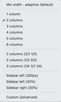
When Source version 2 shipped we also included a nice update to Grid Plus Pro which helps newbies to CSS Grid get started with using these values a bit more easily. We now let you select from a number of preset options to set up your 'column definitions' for each breakpoint (see image below). As a bonus, when choosing any of these options we also display the actual syntax that is then used so that you can see this, learn from it and adapt it for your own needs going forward.
Let's see some of these in action....
2 columns (column definition: 1fr 1fr)
1fr
1fr
2 columns (⅓ ⅔) (column definition: 1fr 2fr)
Here we can see that column 1 takes up 1 fraction of the available space and column 2 takes up 2 fractions of the availabe space (column 2 is therefore 2x the width of column 1).
1fr
2fr
5 columns (column definition: repeat(5, 1fr))
This time we have 5 columns and instead of writing out 1fr 1fr 1fr 1fr 1fr we are using the shortcut method repeat which is simply saying that we should repeat 1fr 5 times (for our 5 columns).
1fr
1fr
1fr
1fr
1fr
Sidebar right (30%) (column definition: 1fr 30%)
Here we are using a percentage value (30%) alongside ourfr unit. With CSS Grid you can mix and match units for different columns. Note: Although you may think we could have achieved this same layout with a column definition of 70% 30% we are best using the fr unit because (as it is concerned with the 'available space') it takes into account any gapping used in the grid. If we used 70% and 30% that is the full 100% width used up and doesn't take into account our gaps (10px in this example).
1fr
30%
Custom 4 column (column definition: 100px 1.5fr 1fr 23%)
Here is an example of mixing up different units. If you change the width of the screen you will see that the 100px column stays at a fixed width whilst the others all adapt to the remaining space.
100px
1.5fr
1fr
23%
What about different set ups for different devices?
In Grid Plus Pro we can set up a different column definition for an unlimited amount of breakpoints (Note: grid Plus is limited to 3 breakpoints)! Here is a typical example: On mobile we might want just 1 column (1fr) on medium devices we might want 2 columns (1fr 1fr) and on large devices we might want 3 columns (1fr 1fr 1fr). We can of course use any combination of values at any of the breakpoints!
What else can Grid Plus do?
There is so much more that you can do with Grid Plus and Grid Plus Pro like:
- laying out your rows in a similar way to what we have done with the columns
- setting up grid items to span multiple columns (and/or rows)
- specifying the exact place in a grid where we want a particular grid item to be positioned
- and much more!
I think though that this introduction to column definitions is enough to get started. Have a play with the preset column options in Grid Plus Pro and if you are feeling brave have a go at setting up your own column definitions!
Grid Plus and Grid Plus Pro are part of the Addon Pack for Source - the micro framework for RapidWeaver.
Not got Source yet? Check it out using the button below.
Use another framework? Not a problem - you can use these amazing grid stacks in any framework using our 'Source Grid Enabler' stack! (NB: Source Addon Pack also required).
Like this post?
Why not share with others that might like it too?!