
Spliced (A bundle project)
| 16 Jul 2024
Spliced project is available for free to new purchasers of my stacks bundle (a bundle of all my stacks - including Source / Source Addon pack). This blog posts walks us through some of the key elements.
Palette
Our Palette stack is one that enables the user to switch the colour theme to their taste (or it can be set to be hidden and to respond instead to the user's preferences for Light/Dark mode and/or normal/High contrast).
In Spliced we have added Palette stack to the Nav bar on every page. Click through the different options and you will see every element on the page change to pick up the new choice. This works for all the Source stacks and all of the additional stacks that we have used too.
Animate
Our super-lightweight animation stack is used to add some subtle animations to the web pages. When used in moderation animation can help to bring web pages to life. Here we are just using it to gently animate in some of the page elements. All of Source's layout stacks include built-in support for the animations.
An added bonus is that by adding the Animate enabler stack to the page it allows us to animate some elements that we couldn't easily otherwise. For example our Popper pattern elements or our Easy Grid grid items (see the project file for how this is achieved).
Splider 2
Our powerful slider stack is used in a couple of places. It powers the Testimonials slider on the Home page and also the continuously scrolling logos element on the About Us page.
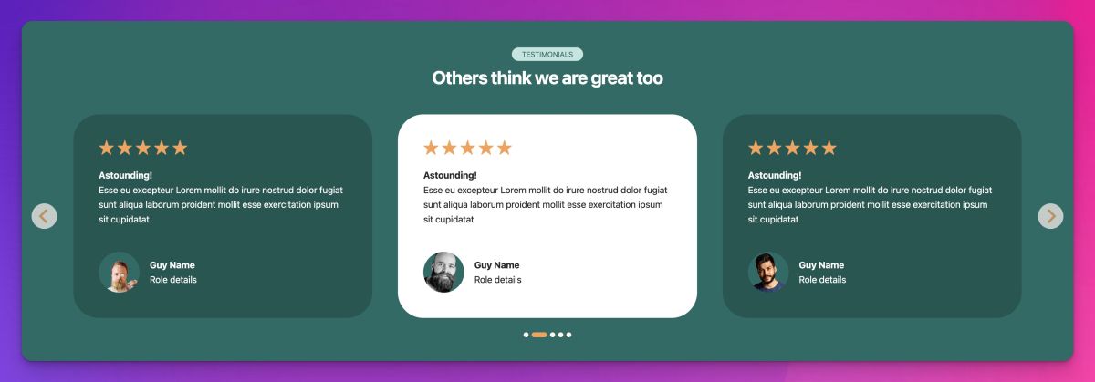
Not only is the Testimonials slider set to pick up the Source/Palette set colours but it also is set up to change the active slide to show in alternative colours.
Easy Grid
The Source Grid Plus stacks are the most powerful grid building / layout stacks available for RapidWeaver. Depending on the desired layout though they can be rather complex to use. That is where our Easy Grid stack comes in. It has much of the same power but allows grids to be set up far more easily. It has become my go to grid building stack - and as I have said before - it is now my favourite amongst all my stacks.
Popper
Creating visually interesting elements on the page can be desirable. It can really transform an otherwise dull page into something more special. The 'About Us' page makes use of Popper stack to bring various elements to life. The mission statement section makes use of multiple Popper pattern elements to build up a cohesive design. We have also set the pattern elements to tap into the animations that the Animation stack enables. And again - toggle the Palette setting to see how the patterns respond.
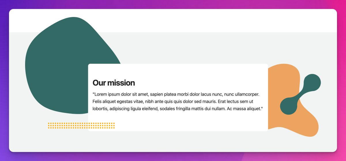
Be sure to update Popper to v1.5 as it is this version that allows tapping into Source's colour schemes and for enabling animation.
Magic Mouse 2
Magic Mouse lets us add a real bit of wow factor to our pages. It transforms the standard cursor into something much more interesting and modern. We showcase it on the Services page where you will see it behave in different ways depending on the element that you hover over. For example hover over the grid items for Service 1 and Service 2 and you will see the cursor transform to contain text. Magic Mouse also supports displaying icons, images and even video inside the cursor!
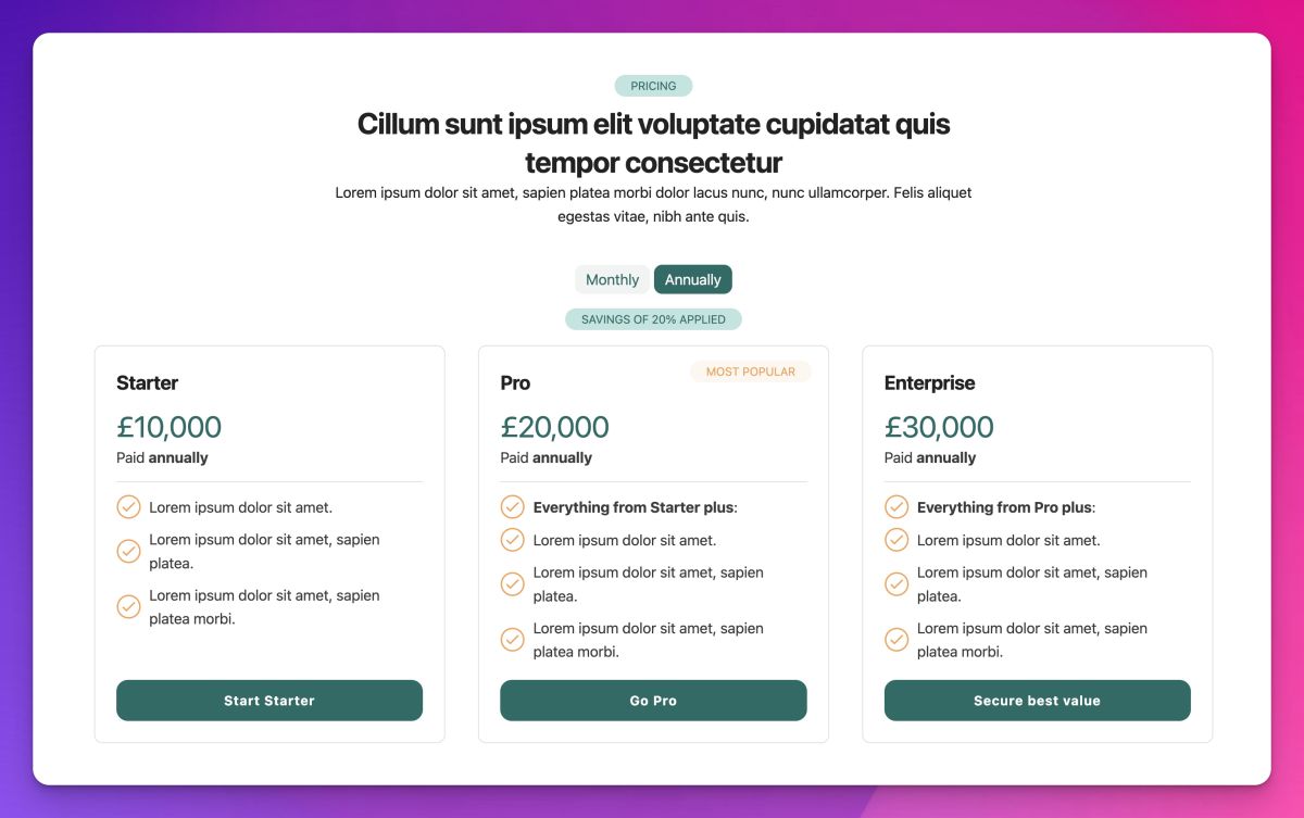
Content Filter
We use the Content Filter stack in a few different areas. It is used on the Home page to power the interaction that allows the user to toggle between Monthly and Annual pricing.
We also use it on a page-wide scale on the Service details page - here we are using a lot of common content but have interspersed content that is specific to either Service A or Service B. On this page we don't give the user a button to select which to view but rather we use a value in the url to control what is seen. You will see that the content shown on the ?service=service1 page is different to what we see on the ?service=service2 page (it is links like this that we use on the Services page to link to the relevant details.
We also use it in the Meet the Team section where the user can toggle between the different job roles. Note too that this section incorporates the use of Popper to create all of the different backgrounds for the avatars.
Moreish
Our 'Read more' style stack is used on the Service details page. It is a great way of hiding some 'nice to know' information that is easily accessible to those who do want to dig into the detail a bit more.
FAQ Toggle
The FAQ stack powers (surprise surprise) the FAQ section on the Service details page. This is a page where we are showing different content depending on the page filter. We can tap into this power with the FAQ stack too and you will see that the same FAQ stack includes service-specific content that gets shown/hidden depending on the filter applied.
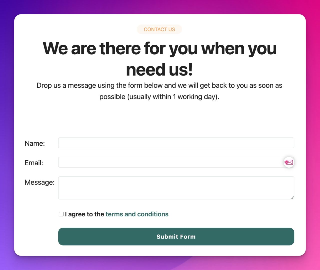
Contact Form
I don't offer a contact form in Source or via any of my other stacks. I took the opportunity in Spliced though to showcase how a (free) third-party tool can be incorporated to create a working contact form. It uses our Coder stacks to handle the code snippets and our Grid Plus Pro stack to handle the layout.
So there you have it! Hopefully Spliced shows the kind of things that can be done when you use Source and my other stacks together.
Enjoy 😄
Like this post?
Why not share with others that might like it too?!