Versus (A Source project)
| 23 Jun 2023
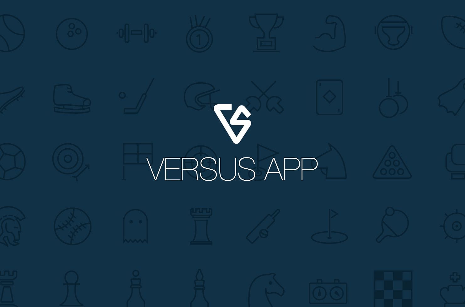
In 2017 I picked up a copy of RapidWeaver (and very quickly Stacks too!) to create a website for an iOS app that I had developed - an advanced scorekeeping / tracking app called Versus. I hadn't touched that website since then as I quickly became distracted by developing my own stacks (and then of course Source too). I recently reviewed the Versus site and although I still liked the layout and design of the site it was a bit dated in places and performed poorly. Long story short...it was time to bring the site right up to speed using....surprise surprise....Source!
Having recreated the site (view the results here) I thought it would probably be a good one to release as a Source project as it incorporates quite a few features that I added that I am sure will be useful for many Source users.
The project is available now - either as a direct purchase or as part of our (ridiculously priced) lifetime bundle.
Here is an overview of a few of the particularly note-worthy aspects of this project....
A one-page site
Many websites need just a single page to get their message across - and that is often the case for sites that have been built to support / advertise apps.
One feature that is useful for pages such is this is to have a navigation system that links to the various distinct sections on the page. The Source Nav stack does not cater for this out-of-the-box but there are many workarounds in use that involve adding the links to the Nav stack's CTA section. Although this works just fine I have utilised a different approach here. Using a couple of code snippets we 'inject' our desired links into the existing Nav stack where they operate as normal nav links.
What this also lets us do is to monitor what section is in view and have that highlighted in the Nav bar (using the standard Nav styling settings). Check out the site and see this in action as you scroll down the page (or use the links)!

All of this code is included and annotated so that you can very easily use the same approach in your own one-page Source sites.
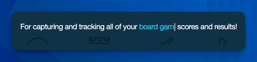
The typewriter effect
A feature of the original site that I wanted to retain was the typewriter effect in one of the text sections - where a segment of the page heading constantly updated itself to showcase many different use cases for the app. Source doesn't have a dedicated stack for this but the code that it needs is really simple and so the code for that is also included (and again can be easily translated for use in your own sites).
The sticky section
Another notable feature of this project is the 'How it works' section where we use Source's Sticky stack to reveal items in a really interesting way. You see this type of effect on many modern web pages though it is generally done with a lot of javascript. The Source version is generated purely via CSS (and no custom CSS)
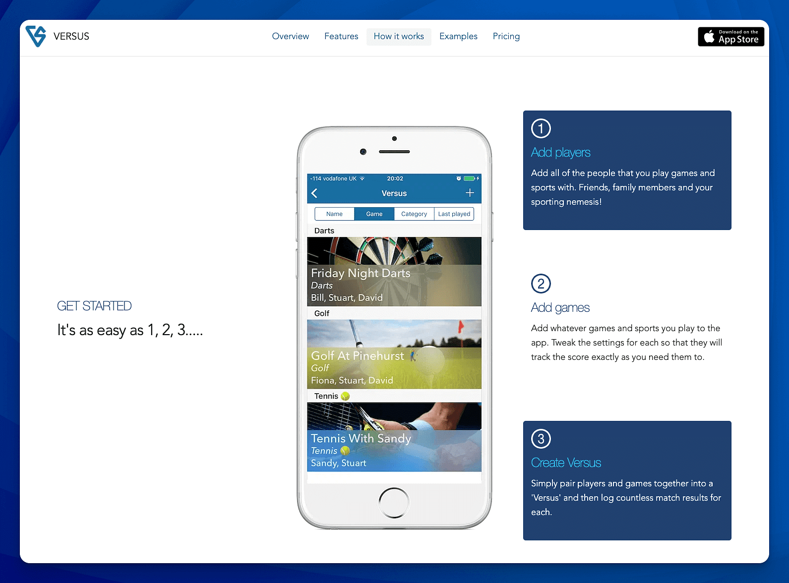
On smaller screens the same content is presented in different ways (without the sticky behaviour).
The examples section
The page also features a responsive image grid that shows 8 different sports/games and - when you hover over the images - reveals some additional information (in this case some suggested app settings).
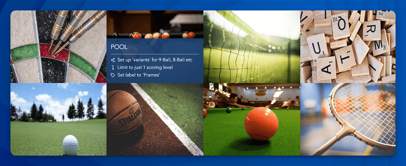
Hiding and revealing content in this way uses some of Source's in-built utility classes. View our blog post dedicated to showing and hiding content in this way.
Conclusion
So was it worth it? Yes - it all looks a bit fresher and it has vastly improved the speed / performance (from a score of 44 to a score of 99!). And it showcases just how much you can do with just the Source/Source Addon stacks (the original needed a framework, 2 add-on packs and a bunch of additional third-party stacks).
I just need to get round to updating the app now too!
Like this post?
Why not share with others that might like it too?!