
Lazy loading images in Source
| 27 Dec 2020
Lazy loading an image simply delays the loading of it until it is needed or until everything else has already loaded. This post will look at 2 modern methods to achieve this.
But first things first...
Properly optimising the images is still a vital first step. Both in terms of dimensions and file size. After resizing images to appropriate widths you should use image compression tools to get the file size as small as possible.
Additionally, where possible, you should supply images of different sizes that are suitable for different screen sizes. The Source Image stacks both allow for up to 4 versions of an image to be supplied.
For even greater control over image delivery check out our Srcerer stacks!
So, now that we have optimised images, we can now look at how to set these up to lazy load on our Source web pages.
Native lazy loading (recommended)
Many browsers now natively support lazy loading images (it is really only Safari that does not yet support this - but it will come soon). The code will cause no negative effect in browsers that don't yet support this (the images will load normally).
All we need to do to take advantage of this native lazy loading in Source is to flag which images we want to be lazy loaded with a little bit of code: loading="lazy".
In the Source image stacks we can add this to the 'Custom attribute field' (see below).
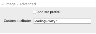
When using this method, the official recommendation is to also provide a width and height value. This isn't required but it can help prevent some shifting of content as the images load. If you do want to add these values then these can be added in the same Custom attribute field alongside that previous bit of code - i.e. loading="lazy" width="600" height="400".
Note: the actual values don't really matter (and don't add size units here). The values are really just used to describe the aspect ratio.
Lazy loading with JavaScript
The previous method is the recommend approach but if you want to ensure wider support (and actually prevent the downloading of images altogether if the user doesn't scroll right down the page) then there is an alternative method that we can use.
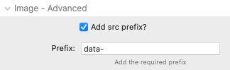
Step 1: For any image that we want to set to lazy load we need to set it up with a 'src prefix' of data-. This changes the image source attribute from src to data-src.
Step 2: Add the class source-lazy to the custom CSS fields of the containing Source Container / Grid stack(s).
Step 3: The following JavaScript needs to be added to either the page or project code settings:
const images = document.querySelectorAll(".source-lazy img");

function showImages(el) {
  el.src = el.dataset.src;
}

const imagesObeserver = new IntersectionObserver(function(entries) {
  entries.forEach(entry => {
    if (entry.isIntersecting) {
      showImages(entry.target);
      imagesObeserver.unobserve(entry.target);
    }
  });
}, {});

for (let image of images) {
  imagesObeserver.observe(image);
}
With these things in place the JavaScript code above will monitor where the images are on our page and only add the proper src value when the image is near to coming into view.
Final notes
You will only want to use either of these methods with images that appear 'beneath the fold' on your web page - i.e. not with images that should be immediately visible at the top of the page!
The second method uses the 'src prefix' option which is an approach that is also used if you are using an online image optimisation and delivery service (I have used and can recommend Gumlet <- affiliate link).
So there you have it....more ways to make your lightweight Source web pages load even quicker!!
Like this post?
Why not share with others that might like it too?!